

creative direction
✦
copywriting
✦
concept
✦
strategy
✦
creative direction ✦ copywriting ✦ concept ✦ strategy ✦
KOLESTON
RETAIL
ACTIVATION
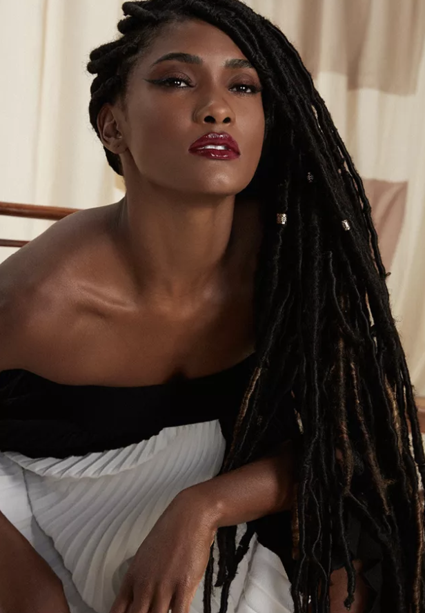
koleston had momentum. brand relevance was back. identification? not quite. women trusted the formula - they just couldn’t see themselves in it yet. until now ✦
client
wella ✦ koleston
year
2025
on the media
meio & mensagem
live mkt news
B9
cosmetic innovation
role
senior copywriter and conceptor
but how?
you don’t commit to a new hair colour because it’s sitting on a shelf. you commit when you can actually picture the version of you that walks into a room with that tone. you test it mentally long before you ever open the box.
so instead of pushing product harder, we decided to hack the behaviour that was already there. women were already using filters to imagine new versions of themselves. what if we took that instinct out of the screen and placed it directly in the street, at full scale?
the first phase happened quite literally on the pavement. we installed a human-sized koleston box at a bus stop, turning it into an interactive ar mirror connected to a product machine. women could see themselves trying different shades in real time, choose their favourite, and if they found their match, they didn’t leave with a promise.

they left with the actual product. the result was immediate. lines wrapped around the block. people were filming, sharing, reacting. it stopped being an activation and ✦ became a moment ✦
two weeks later, we brought the experience into retail, taking over the shop window of a major beauty store on avenida paulista. this time the focus was visibility and aspiration.
the ar mirror lived in the window, inviting passers-by to test their shades, step inside, receive exclusive perks and continue the journey in store.
the final phase moved the behaviour back into digital. we launched the tiktok filter so the experience could travel beyond são paulo and into people’s own feeds. by then, the logic was clear - test. see. choose. buy.
food
fandom
& fright

the challenge? create globally scalable launch ideas for Welcome to Derry that turned horror into fun cultural conversations - not just advertising.
client
warner ✦ hbo max
year
2025
on the media
neuquen al instante
info franquicias
role
senior copywriter and conceptor

but how?we were invited to explore big, culturally disruptive ideas for the global launch of Welcome to Derry and our starting point was simple - horror isn’t just something you watch. it’s something you react to, joke about, participate and obsess over.
so we built a slate of ideas that could travel. collabs. product twists. cultural disruptions. things that could adapt market by market without losing their bite.
two of them stood out - one imagined launching a ketchup that looked like blood. familiar, but wrong and PRable in the best way; the other played with the logic of the kids meal in fast food culture. what happens when you make that slightly unsettling? if any brand could get away with poking that territory, it would be Burger King. they’ve built their tone on playful "provoke society” way of doing things.
the Argentine market ended up combining both ideas into one activation, resulting in the “Derry King” combo. a Halloween release that merged the unsettling condiment concept with the fast food collab energy we had explored.
key elements:
✦ global launch ideation
✦ multiple culturally scalable concepts
✦ ketchup as horror object
✦ subverted kids meal logic
✦ two ideas merged into one Argentine execution
✦ the creation of ideas to move a whole fandom

SWEET
& TWISTED

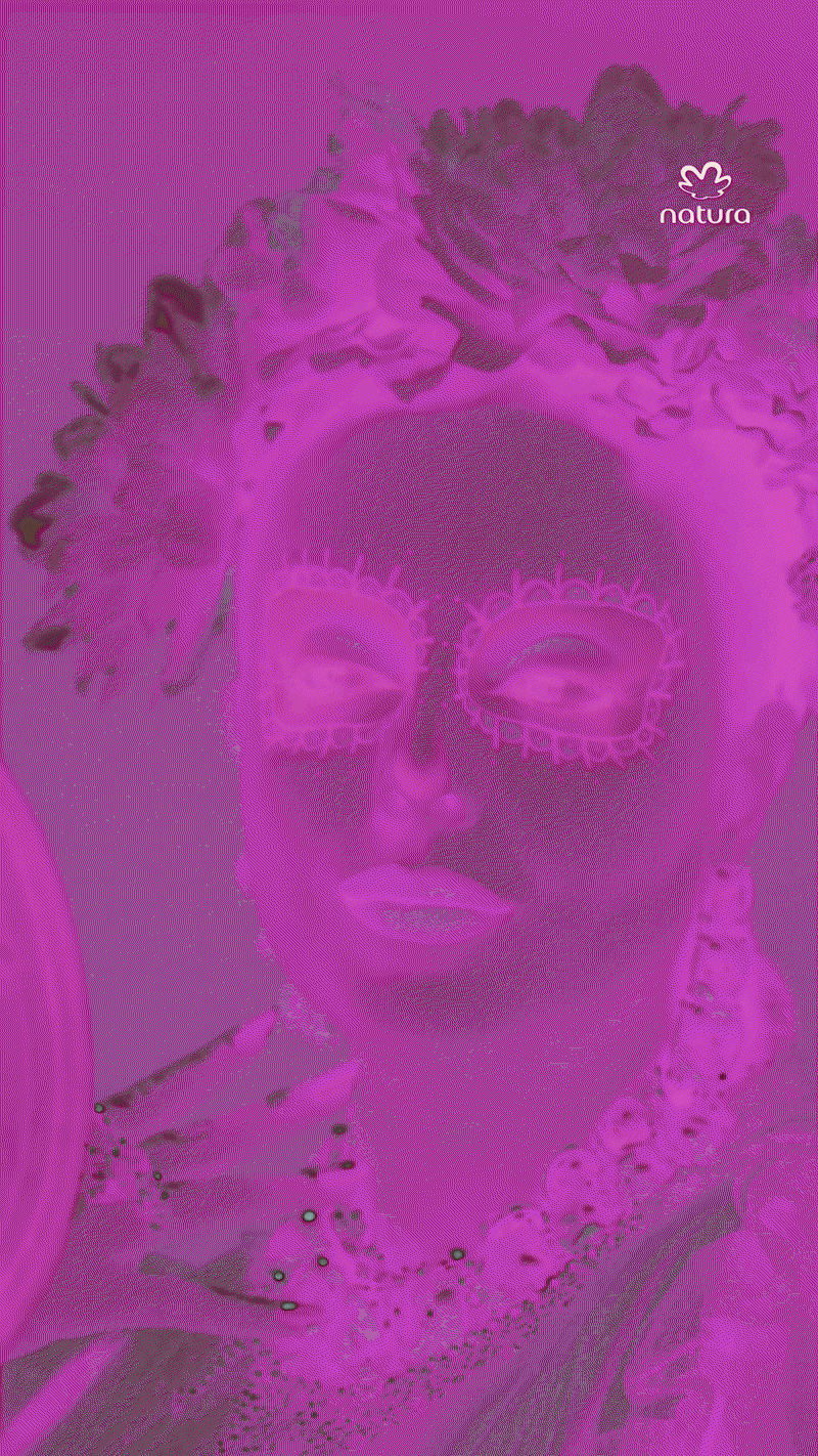
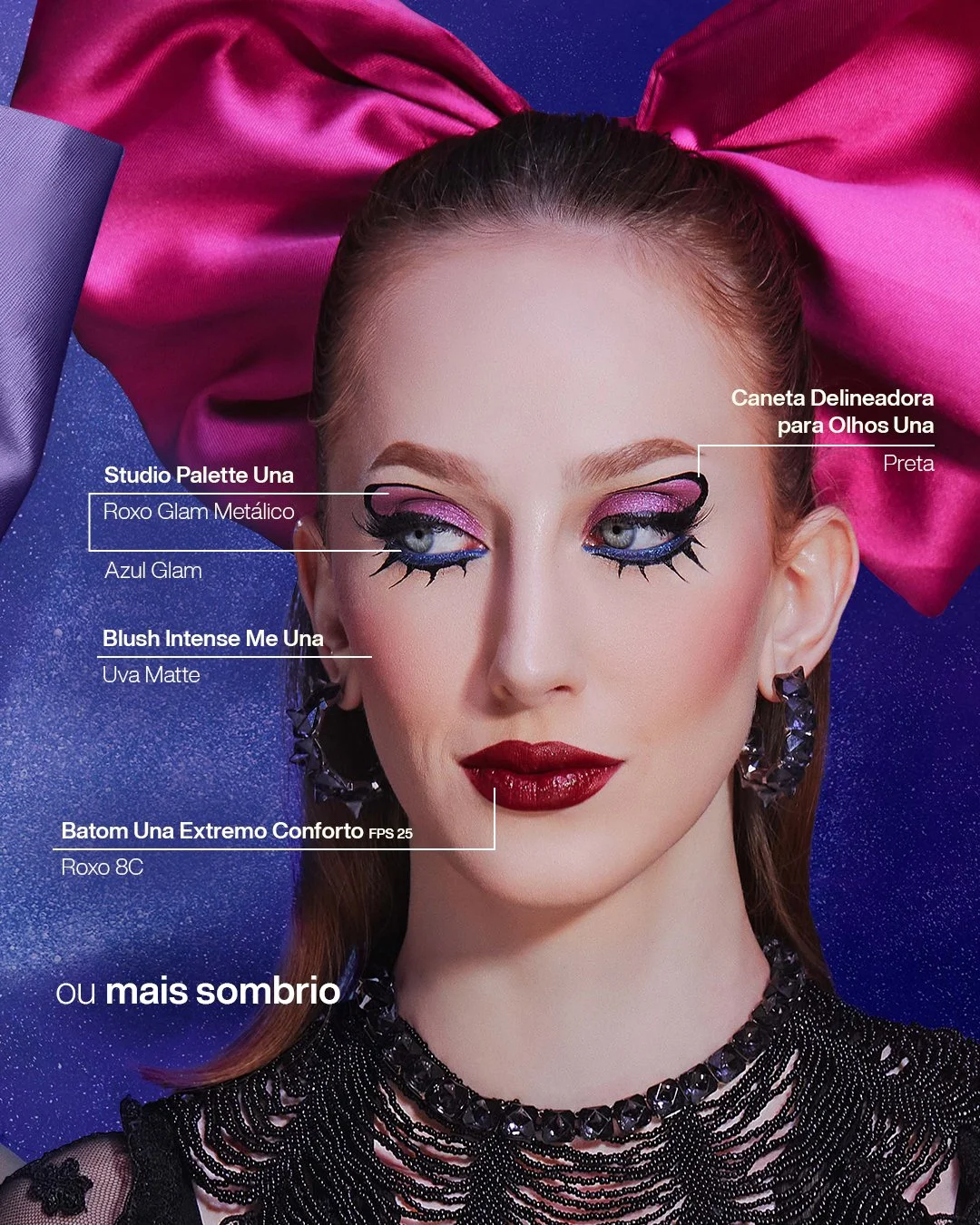
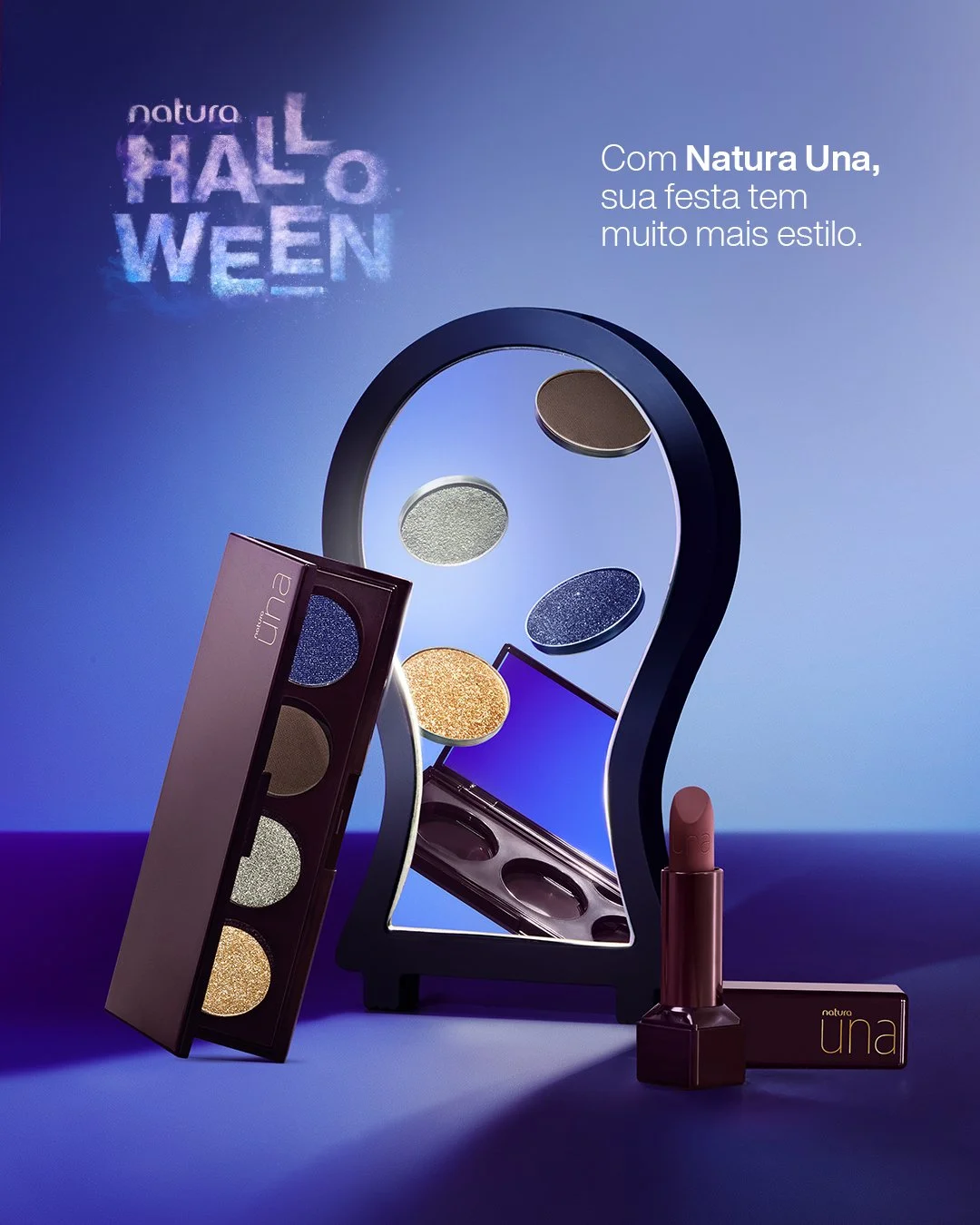

the challenge: bring Latin American folklore to life through makeup for a Halloween that finally looks like us
agency
africa creative
role
senior copywriter
client
natura
year
2024
but how?
me and my creative partner came up with the full campaign idea and all initial concepts and kv crafted for a social-first rollout across Brazil and Latam.
we wanted to reclaim Halloween through a Latin lens, blending cultural pride with the contemporary self-expression of halloween. our idea? a season where local myths, not imported clichés, took centre stage.
we explored the duality at the heart of Halloween - sweet vs spooky, innocence vs shadows - and used
that tension to build a story rooted in Latin American folklore.
from Brazil’s curupira and iara to Mexico’s llorona and catrina, we tapped into powerful cultural icons and gave them a glow-up via makeup to create something haunting, modern, and totally ours.
through Faces and Una, we created 2 different looks for every character in short films that turned into dynamic tutorials through glitchy edits and high-drama transitions for both brasil and latam markets.
key elements
✦ created the concept, storyline and key assets for initial rollout
✦ used the mirror as a literal and symbolic tool to reflect identity and connect to halloween stories
✦ infused tutorials with telenovela flair, dramatic narration and Latin horror aesthetics
✦ ensured full Latam representation with the biggest makeup creators from the brand's squad
✦ translated a product story (Faces + Una) into cultural storytelling
THERE'S MORE TO IT

the challenge: help Suave step into a new era - with a skinified take on hair & body care that speaks to real people, real routines, and real results
agency
matter
role
senior copywriter
client
suave
year
2025
but how?
I co-created and wrote the creative foundation for the new US campaign, scripting hero films and adaptations for every key product: Bonding Shampoo, Dry Shampoo, Purple, Mask and Women’s Deo, all under the previously created brand platform "unexpectedly good” and the “there's more to it” campaign.
together with my creative duo, my role was to turn product benefits into relatable stories, writing V.O. and captions that balanced clarity,
charm and functionality for the US market. from busy mornings to effortless confidence, every line was crafted to connect with real women, real men and real routines.
whether it was a dry shampoo lifesaver or a bonding moment between friends, the films helped shift Suave’s voice: smart, light, care-forward - with just the right amount of behaviour glow.


WEAR YOUR TRUTH
the challenge: update brand codes and pov for an ultrafeminine new eve fragrance flanker in a global campaign spanning from the uk to brazil, italy to germany, spain to bosnia, and beyond.
agency
jwt (wpp)
role
senior copywriter
client
avon
year
2018

but how?our squad crafted the entire campaign focused on developing a digital film to promote the new fragrance and a global guide for the entire campaign to ensure the other markets followed the same creative concept and quality.
the global film with eva mendes was already in the can, shot under a different concept. but when we created the new concept, wear your truth, it resonated with a broader, contemporary audience. the client was all in for a new vibe, using bits of our voiceover, recreating what was already done, and adding some slick elements from our digital video in the global tvc.
as for the script, I aimed to cook up this super-empowered sisterhood feel. stating that being your true self is the ultimate way to keep it real with those you love and look up to: your friends, your ride or dies. the client wasn't feeling the old-school vibe from the previous campaign launches, so we decided to hit refresh on the typical fragrance campaign codes with an inspiring message wrapped up in a sensory and aesthetic experience. like a whole world inside that bottle.
ALLIES
MOVE
TOGETHER
the initiative was specifically designed to address the daily prejudice and attacks that the LGBTQIA+ community faces in uber rides.
agency
indomita + soko
role
senior copywriter
but how?
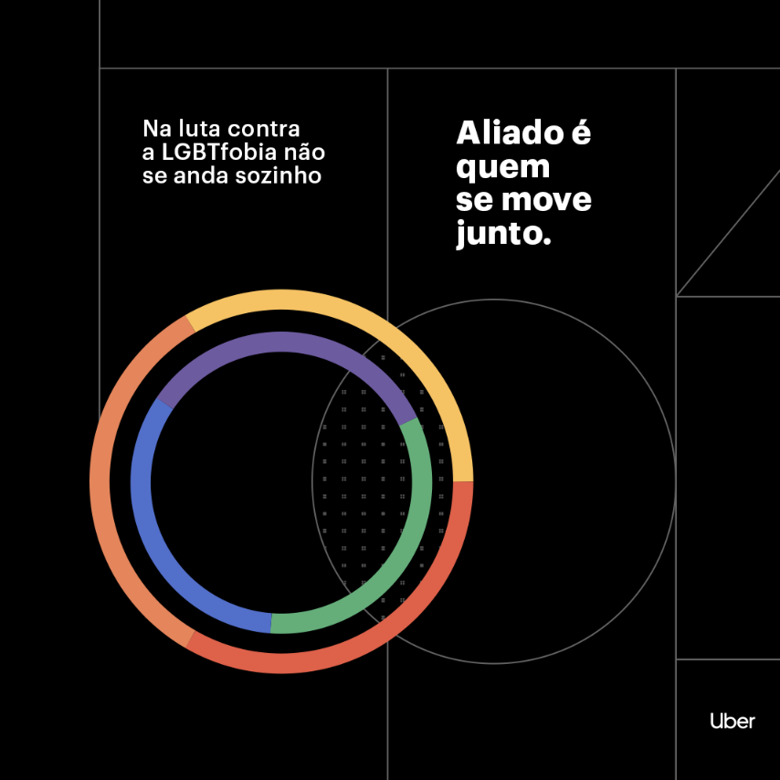
to kick off the campaign, we enlisted the help of one of Brazil's most prominent boxing fighters, Popó. his own son is gay, and he was eager to become an ally in the fight against discrimination. we then created a series of compelling content using Uber's data to expose and combat LGBTQIA+phobia in the ride-sharing service.
but we didn't stop there - we wanted to demonstrate uber's commitment to being an ally to the community. so we organized a PR stunt that involved reopening an exhibition from the são paulo sexual diversity museum, which had been previously closed down by a conservative government.

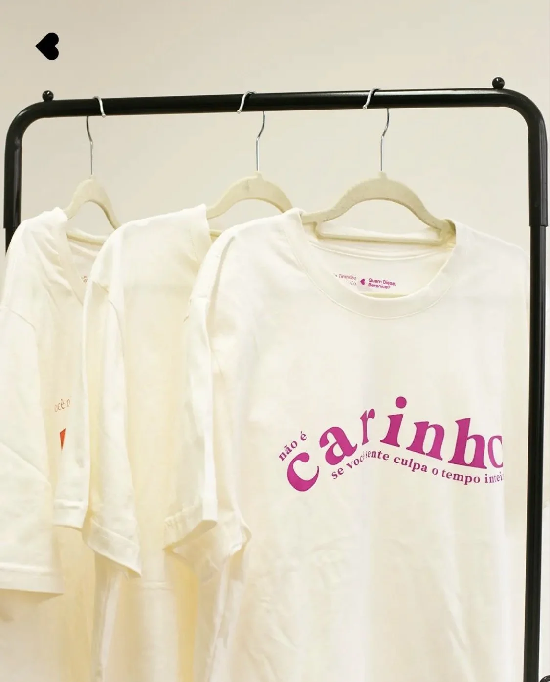
for realNO GUILT

👈 click on it to watch
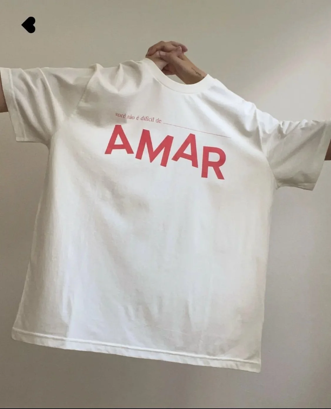
through an innovative social strategy using be real, quem disse berenice reveals that beautiful selfies could often mask a problem: behind a smile there can be actual victims of psychological violence.
but how?agency
w3haus + digital social
role
senior copywriter and conceptor
be real is such a unique and distinct platform that I had to dive deep into the users' behaviour and really get a grip on the ins and outs of the content journey first.
but here's where things get interesting. right before woman's day came round, we planned to kick off our campaign with a proper bang. picture this: a different influencer taking over the brand's be real every day. each of them rocking a t-shirt with a single, eye-catching word like "love" or "strong." but hold your horses, 'cause there's more to it. if you decided to zoom in, you'd discover a hidden message. lines such as "it's not loving if it makes you feel guilty" or "you're not hard to love," for instance.
having collaborated with the creative VP in crafting the project, I subsequently passed the baton to the team for executing the plan on their channels. we unleashed a reel with an investigative creator who spilled the tea about the entire brand activation surrounding the t-shirts. and mind you, our efforts didn't cease there. we devised an extensive influencer strategy to ensure the campaign's enduring strength + a lot of PR.
and the t-shirts weren't just for effect, either. the brand has partnered up with local fashion brand, lela brandão, to create these beauties, and here's the best part: all the proceeds were channelled right back into offering therapy for victims of psychological violence.
CHIVAS
👆click on it to watch

VENTUREbut how?on a creative sprint, we fully overhauled the program in brazil, aiming to make a tangible impact by removing its globally renewed competition format. our focus? empowering black Brazilian women-led businesses, fostering equity, fortifying their projects and driving genuine change for an inclusive entrepreneurial landscape.
agency
eixo
role
creative director
over a 5-day sprint with a bunch of experts in business, strategy, comms, and impact gigs, we had the task of reworking the programme in Brazil. we wanted a fresh approach, looking at it through the eyes of innovation and generosity, to make a real difference with social impact for projects that were up and running but needed some extra cash to really take off.
we picked these "street ceos" because of their promising projects and all they could bring to the table and the real change they could make in their communities.
meanwhile, we made sure Chivas pitched in with teamwork, production, and a bit of media backing, creating a solid environment for these business women to flourish within a mentor program led by the Brazilian actress and media boss, Tais Araújo
I was in charge of steering the creative direction, making sure we had a strong, unified message throughout all strategy. this involved crafting and leading the creation of a campaign video prototype, standout visuals, and some creative ideas for social media and pr.
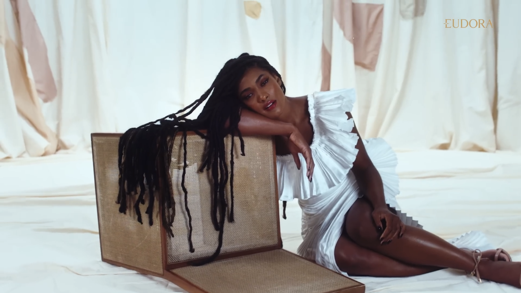
your shine
is uniquethe
impostorcover
click on it to watch 👉
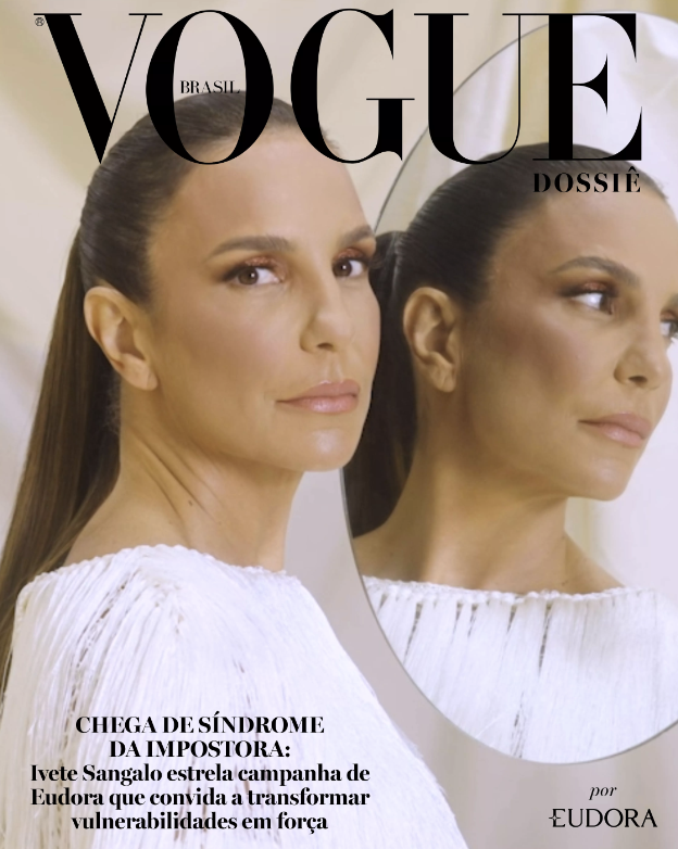
but how?looks can be deceiving. bringing together a team of celebrities, eudora discusses the self-esteem of Brazilian women who struggle with the "impostor syndrome", present in 70% of the population.
agency
akqa
role
senior copywriter
client
eudora
year
2022
on the media
vogue brazil
abramark - the brazilian academy of marketing
propmark
forbes
+
"I don't always feel like this unique or special person, someone who deserves a bit of a spotlight. deep down, I'm a bit wary of standing out too much." - this guided us creatively and strategically when we were cooking up this manifesto campaign, where eudora takes the stage to shine a light on what makes each woman one of a kind.
eudora's sophistication used to get labeled as a bit surface-level, tied up with flashy appearances and no purpose. we spotted a golden chance to really connect with consumers by shouting out the brand's new positioning beyond just looking good or having a killer product.
so, we cooked up this campaign that kicks off by telling the story of what makes each woman uniquely beautiful – in attitude and personality. we made it all about celebrating the brilliance of being true to yourself and your "flaws”.
in portuguese, "eu" means "me," and I had a bit of fun
playing with the "eu" of eudora but also with the different "eus" (selves) of consumers, direct sales consultants, and the products themselves.
but another manifesto? really? I don't think so! we put together this co-created advertorial with Vogue Brasil, which also produced our campaign video with 3 powerful women in brazilian media: Ivete Sangalo, Camila Queiroz, and Erika Januza, who took center stage to open up about their journey with the impostor syndrome.
we didn't stop there; we threw in some cool ideas to keep the campaign alive on the brand's social media and PR. including inserts at the annual Vogue Ball, a talk led by Brené Brown and even a full spread about the imposter syndrome on Brazilian Vogue.
oh, and the cool twist? Even though the project eventually moved on from AQKA, the brand gave me a nod to wrap up the scripts and put the finishing touches on them for the final version filmed by the magazine.
CARNAMARATHON
boozing just doesn't hit the spot like it used to. especially for gen z, who reckon going overboard on the drinks totally wrecks the fun. to kick off Beats' (AmBev) mindful alcohol consumption platform for the younger generation, we decided to dive headfirst into the grandest, brashest brazilian bash: carnival.

but how?agency
akqa
role
senior copywriter
building on the brand platform AKQA cooked up, "the moderate shall be exalted," (os moderados serão exaltados) our creative crew championed those hardcore party lovers who know how to have a blast without dealing with the fallout of going overboard with drinking.
my partner and I teamed up with another dynamic duo from the agency to whip up a killer script. alongside co-writing it, we cooked up the concept for the film, a slick portrayal of gearing up for a marathon that turned out to be a carnival marathon.
our main character wakes up, throws on a fit, laces up some kicks, cracks open a Beats, and hits the streets, dancing her way to several carnival parties.
on top of the film, broadcast nationwide throughout the carnival period, the brand also rolled out a cereal bar designed to take the edge off blood alcohol levels.